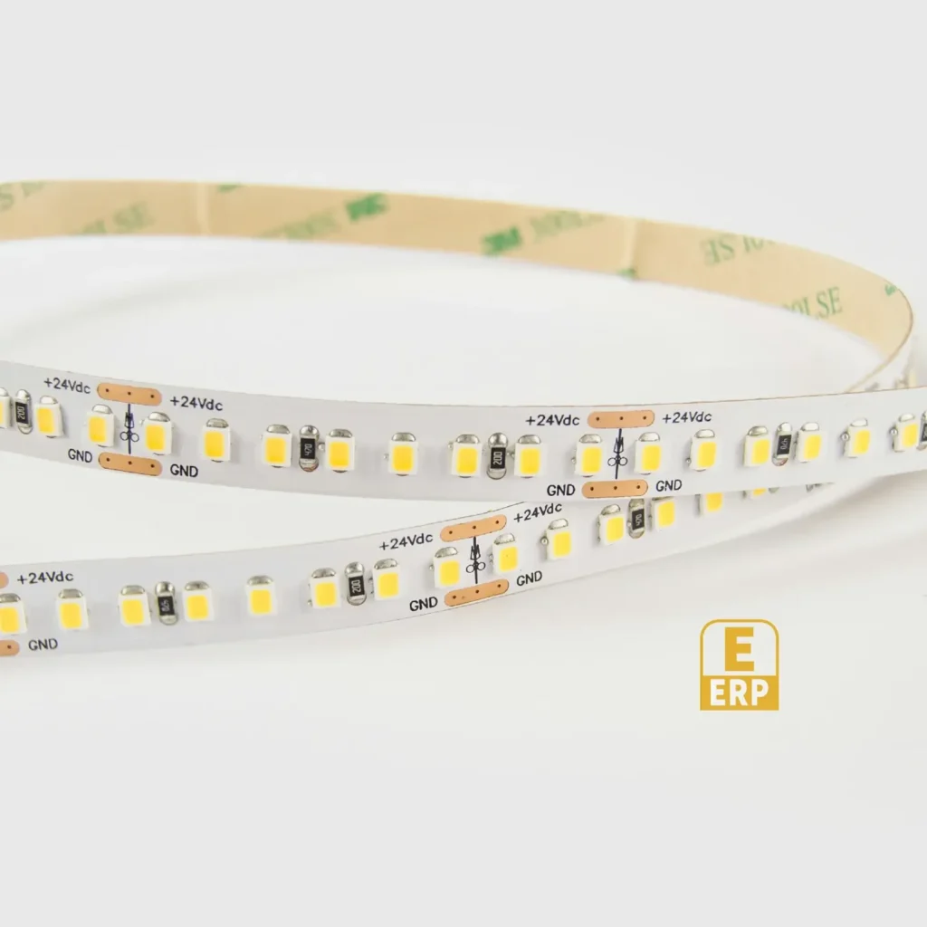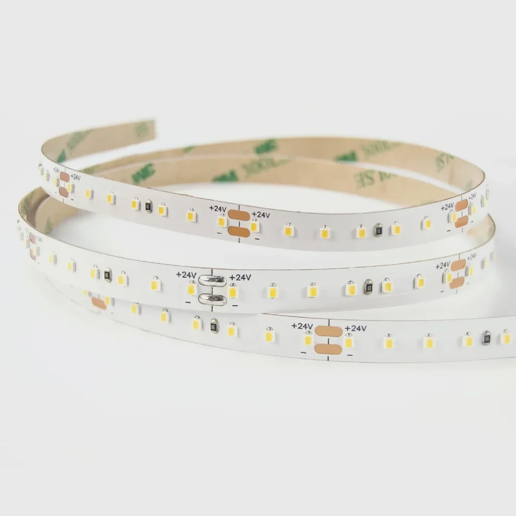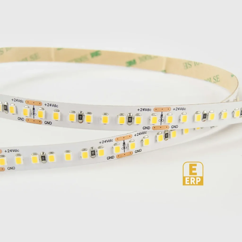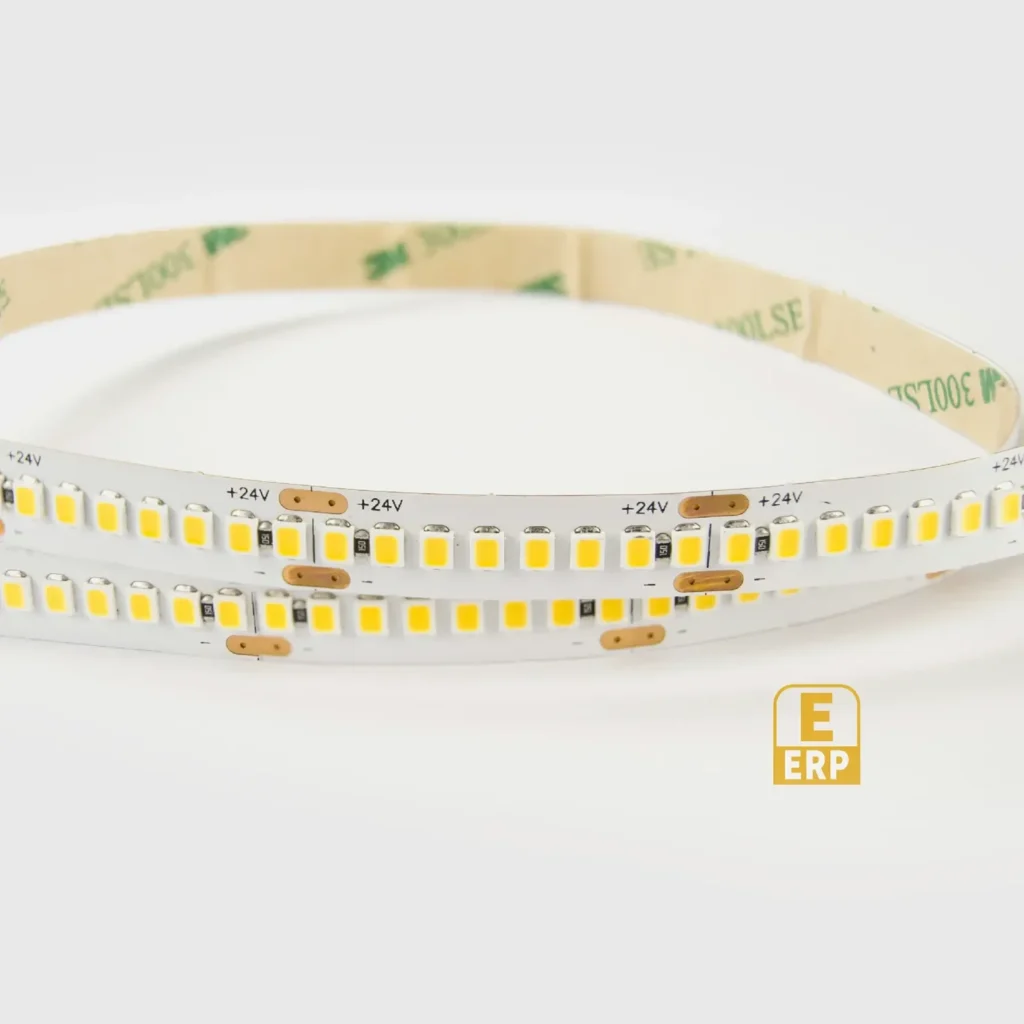

Side-by-side: warm white versus neutral-looking white
The 3000K-to-4000K choice normally changes the kitchen's white-light character more substantially than 2700K-to-3000K. The useful question is whether the worktop should read as part of a warm room or as a more neutral working zone.
| Decision | 3000K | 4000K |
|---|---|---|
| Relative appearance | Warmer, with more yellow character | Less warm, more neutral-looking |
| 3000K ceiling lights and pendants | First candidate for a coherent nominal CCT | Creates a visible change in the cabinet zone |
| 4000K ceiling lights | A deliberate warm accent or task contrast | First candidate for a coherent nominal CCT |
| Cream paint and warm timber | Can support a warm material palette | Compare if the design brief calls for a less warm presentation |
| White cabinets and grey stone | Keeps the scene warm but may warm pale surfaces | Worth comparing when a more neutral appearance is the goal |
| Glare on polished stone | Position and shielding still matter | A cooler-looking line can still produce the same unwanted reflection |
| Task performance | Needs sufficient, well-distributed output | Cannot be inferred from 4000K alone |
These are comparison directions. The exact paint, stone and LED spectrum decide the observed material colours.
Which is better for food preparation?
Neither CCT guarantees a better working light. First determine whether the strip illuminates the usable counter rather than mainly the backsplash. Check shadows from the cabinet lip, appliances and the person using the counter. Then choose the white appearance of a light arrangement that actually reaches the task.
For example, consider two proposed assemblies: a 3000K strip that distributes light across the preparation area and a 4000K strip mounted so far back that its strongest light falls on the splashback. Choosing 4000K does not correct the second assembly's distribution. This is a design comparison, not a measurement of two BEXLIGHTING products.
Food appearance is another decision. Compare representative ingredients and a white chopping board, not only an empty stone counter. CCT does not disclose how the source renders red, green or other colours; consult colour-rendering data where this matters.
White kitchen, wood kitchen or open-plan room?
In a white kitchen, decide whether the white finish should appear warm or relatively neutral in the evening. A customer who dislikes the yellow cast of the existing 3000K light may prefer a 4000K comparison. That preference does not establish a universal rule that white cabinets require 4000K.
With oak, walnut or cream finishes, compare the whole palette. A warmer source can support the intended atmosphere, but a naturally golden finish may become warmer than wanted. For grey or cool-toned stone, include the actual slab or an accurate offcut: its undertones can be more important than a paint colour name.
In an open-plan kitchen, stand where the living-room lamps, pendants and cabinet line are visible together. Use 3000K if the brief favours a continuous warm scene. Compare 4000K if the working area is intended to feel more separate. If the difference looks accidental, matching the scene is more useful than choosing a Kelvin value from a room chart.
What changes when daylight disappears?
A cabinet that looks acceptable beside a bright window can dominate the evening scene. Review the two options after dark with the normal ceiling and decorative lights on, then with the cabinet light alone. These are two operating scenes, so record which one is the main acceptance condition.
For morning preparation and lower-output evening use, dimming may be useful. It changes output; it does not automatically move a fixed-white 4000K strip to 3000K. If both CCTs are required from one installation, a compatible tunable-white assembly is a separate specification.
A decision you can put on the quotation
A useful instruction is: “Compare the 3000K and 4000K configurations for this strip family, in profile P with cover C, on worktop finish W. The ceiling lights are 3000K. The chosen white appearance and required output will be recorded separately.”
This is more precise than “supply the best kitchen colour”. It also lets the supplier identify whether both configurations and comparable output options are actually available. The guide does not establish that every listed BEXLIGHTING model offers both.
Common questions
Will 4000K look blue? It is less warm than 3000K. Beside a warm source it can look cooler by contrast, but a 4000K label alone does not describe an unwanted blue or green tint.
Does 4000K save more power? Compare confirmed efficacy and the required installed output for the actual configurations. Kelvin alone cannot answer this.
Should the cabinet and ceiling match? Match them when a consistent scene is the intention. Use a difference deliberately, with both sources visible during review.
Is 3000K too warm for a worktop? Not inherently. Warmth, useful light level, glare and colour rendering are separate checks.