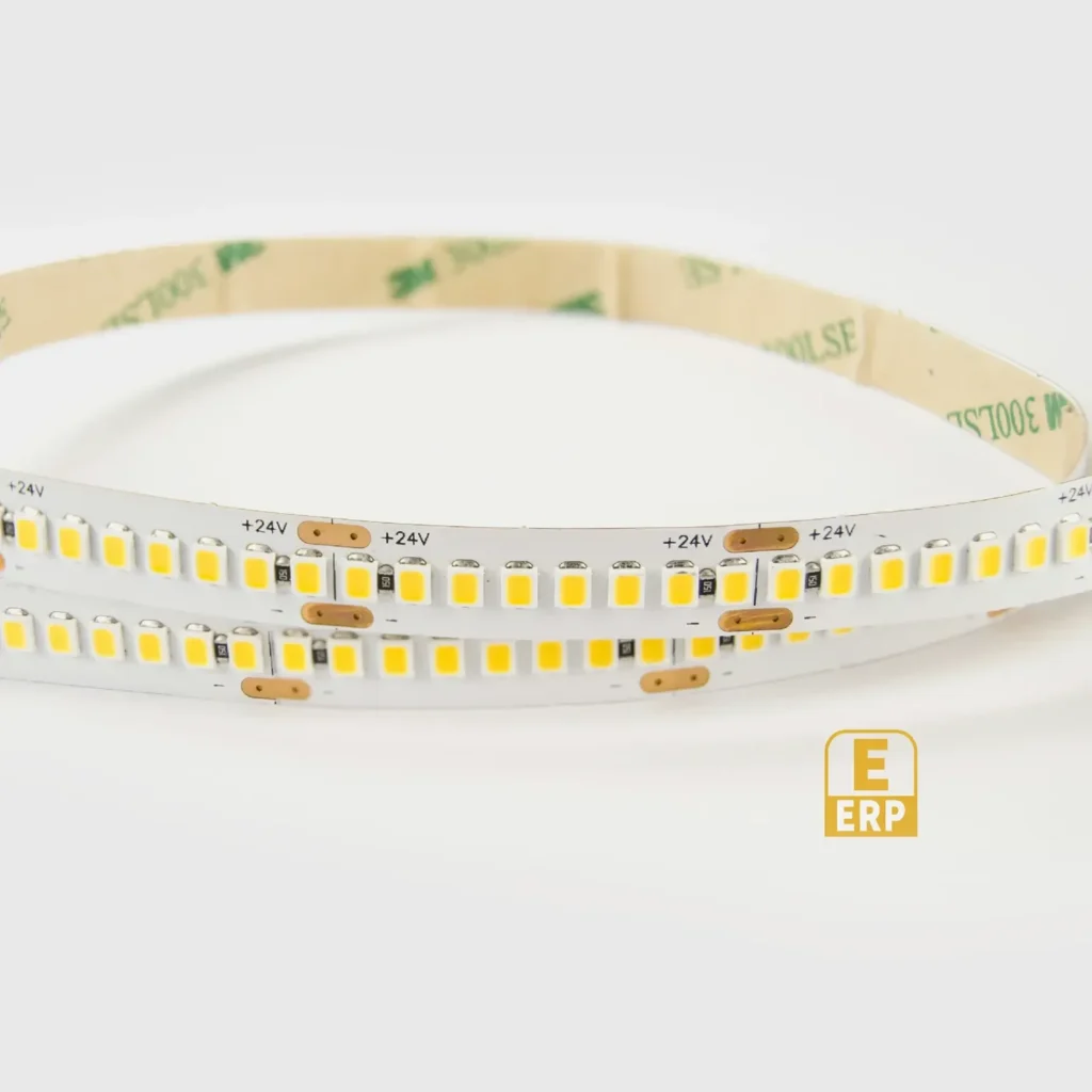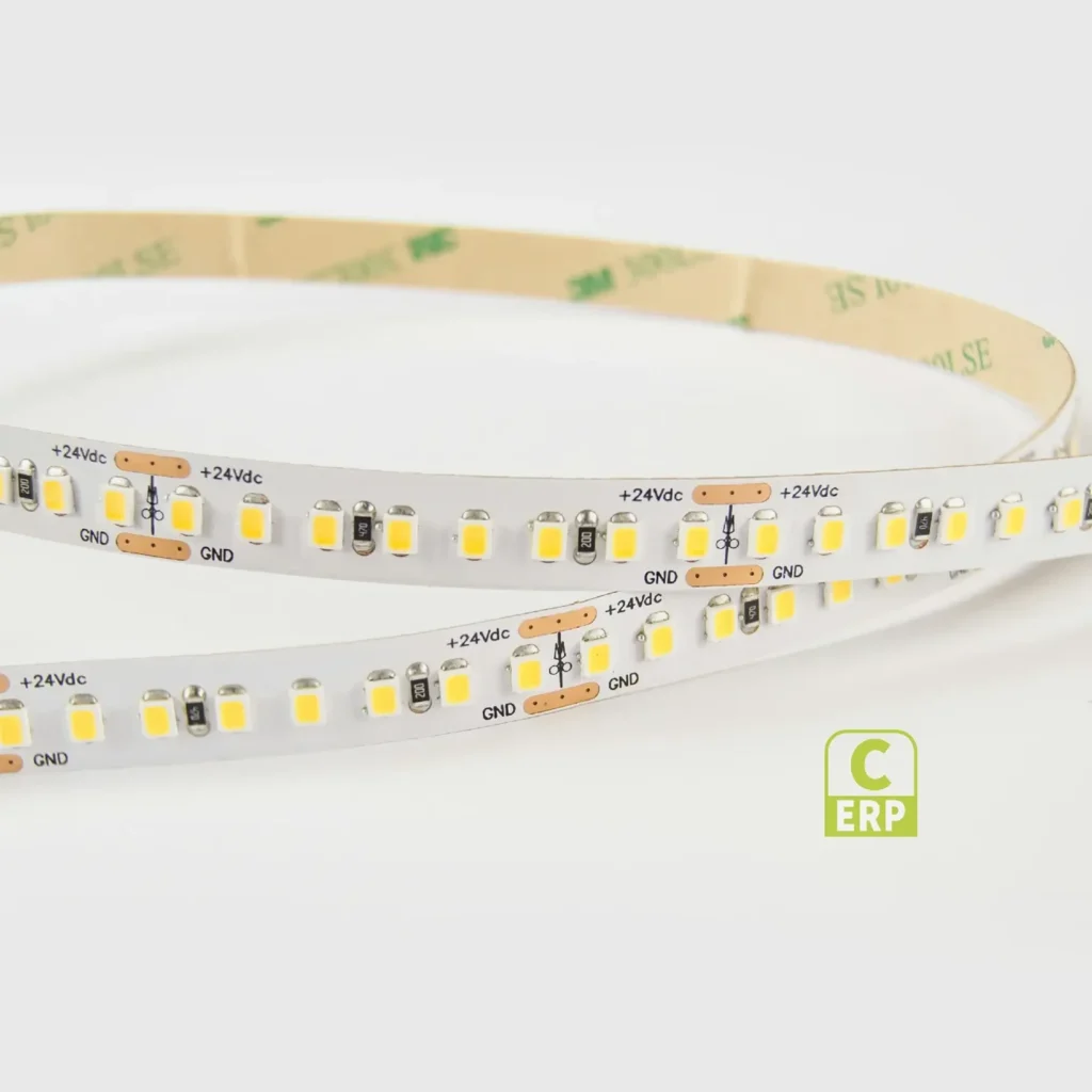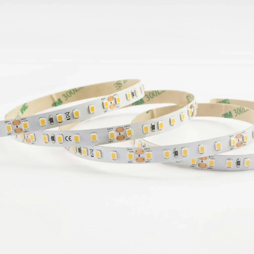

What actually changes between 4000K and 5000K?
This comparison concerns the appearance of the white light, not the quality grade of the LED. A higher number is not an upgrade. The difference may be particularly apparent when the display and shop lighting illuminate adjacent pale surfaces.
| Question | 4000K | 5000K |
|---|---|---|
| Relative white appearance | Warmer of the two; often used as a neutral-white description | Cooler of the two; often described as daylight white |
| Surrounding 4000K shop lighting | Logical first nominal match | Can make the case appear deliberately cooler |
| Surrounding 5000K lighting | Can make the case appear warmer | Logical first nominal match |
| Warm wood, cream packaging or brass | Compare if the presentation should retain warmth | Compare for an intended cooler contrast, not an assumed quality improvement |
| White packaging, metals and pale merchandise | Review the required presentation with the real goods | Review the same goods; cooler appearance is not proof of better fidelity |
| Glare and glass reflections | Depend on position, shielding and surfaces | Depend on the same physical details |
| Colour-critical approval | CCT alone is insufficient | A generic 5000K strip is not automatically a D50 viewing system |
The colour-name descriptions are convenient shorthand, not exact manufacturer binning specifications.
Choose around the merchandise, not an empty case
For textiles, include the colours that customers need to distinguish: dark blue beside black, warm brown beside grey, plus a saturated colour. The purpose is to see the goods, not simply to decide which empty cabinet looks whiter.
For jewellery and metal objects, check the reflections of the source as well as the body colour of the item. A narrow bright strip reflected in polished metal can remain distracting at either CCT. Changing to 5000K does not remove that line; position, shielding and the optical assembly need attention.
For printed packaging, compare the same items inside the display and under the surrounding store lighting. An attractive presentation and a controlled colour-approval task are different purposes. If packaging is being formally approved, use the specified viewing condition rather than treating any 5000K light as sufficient.
When 4000K is the better starting point
Begin with 4000K when the case belongs to a 4000K retail scene and the goods should move visually between shelf and store without an obvious warm/cool change. It is also a reasonable comparison when the interior brief calls for a neutral-looking display without a deliberately cooler feature.
This recommendation comes from the intended scene, not from a claim that 4000K increases dwell time or sales. Those business outcomes would need actual project evidence.
When to compare 5000K first
Begin with 5000K when the surrounding scheme is already 5000K, or when the buyer explicitly wants a cooler white presentation. Include the goods and their labels, because the desired whiteness of a background is not the same decision as the appearance of the product placed in front of it.
A display next to a window should also be reviewed after dark. Daylight varies; “daylight white” on a product label is not a promise to track outdoor daylight throughout the day.
Why colour rendering and tint can change the decision
Two sources with the same nominal CCT can produce different colour appearances. Ask for the colour-rendering information for the exact configuration and identify any numerical requirement before ordering. A single average metric does not describe every colour shift.
If one sample looks greenish or pinkish, do not assume the problem is simply 4000K versus 5000K. CCT is only part of the chromaticity description. Keep that observation separate from warmth, output and reflection comments so the next comparison changes the right variable.
Questions that should not be answered with a Kelvin number
Is 5000K brighter? Compare lumens and installed light levels. It may look different without providing more useful light.
Does 5000K make products look more accurate? Not by itself. Colour rendering, the viewing condition and the merchandise matter.
Can I mix 4000K and 5000K shelves? Only as an intentional zoning choice. If adjacent shelves are supposed to form one display, inconsistent CCTs can make the difference more noticeable.
Is a 5000K strip suitable for print colour matching? A nominal CCT does not establish the required spectrum, geometry or viewing-condition compliance. Use the specified system and evidence for that task.