Find the right comparison
| Pair | Relative change | A specific decision it can answer |
|---|---|---|
| 2700K vs 3000K | Two warm whites; 3000K is less yellow | Match a warm room or give cabinetry a less warm appearance? |
| 3000K vs 3500K | A smaller step towards a less warm white | Is 3000K too warm while 4000K is a larger change than intended? |
| 3500K vs 4000K | Intermediate to more neutral-looking white | Coordinate joinery with an existing 4000K room or retain some warmth? |
| 3000K vs 4000K | Clearer warm/neutral appearance choice | Keep an open-plan kitchen warm or establish a neutral working zone? |
| 2700K vs 4000K | A larger warm-to-neutral contrast | Should a cabinet blend with warm ambient lights or become a distinct feature? |
| 3000K vs 5000K | A substantial warm-to-cooler change | Is the brief a warm interior or a cooler merchandise presentation? |
| 4000K vs 5000K | Neutral-to-cooler comparison | Match the store lighting or intentionally cool the case appearance? |
| 5000K vs 6500K | Both cooler options; 6500K is cooler still | Coordinate with a specified cooler scene rather than selecting “daylight” by name? |
The words warm, neutral and cool are relative descriptions. Use the actual Kelvin requirement on the quotation and confirm availability for the selected model.
Where 3500K helps the discussion
3500K can be a comparison candidate when 3000K is warmer than wanted and 4000K moves the scene too far in the other direction. It is not an automatic compromise that suits every material, and it should not be assumed available across the whole catalogue. Check the offered configuration rather than writing a requirement the selected model cannot fulfil.
What 5000K and 6500K do not establish
Neither label guarantees accurate object colours or a compliant colour-inspection setup. A generic 5000K source is not automatically a D50 system; a generic 6500K source is not automatically a D65 viewing environment. A required reference condition includes more than a nominal CCT.
Do not select 6500K because the work area is dim. First resolve delivered output and light distribution; then choose its white appearance.
Keep four specification questions separate
- CCT: which nominal white appearance?
- Tint and consistency: how may the white point vary?
- Colour rendering: how are the relevant object colours presented?
- Useful output: how much light reaches the intended surface?
Read the exact-pair articles for the first question, the CRI/R9 and consistency articles for the next two, and the brightness guide for the last. This hub should connect those decisions without repeating all their content.
Images and examples
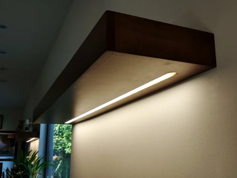
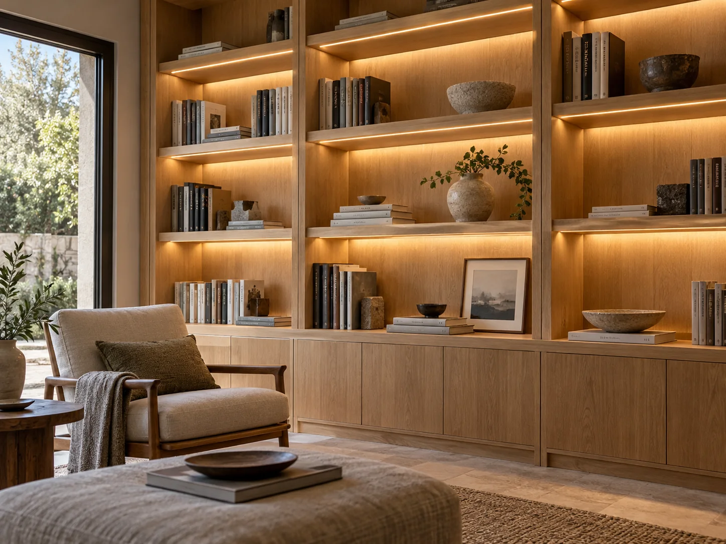
A real interior photograph can explain materials, shadows or a mounting position. Unless its method is documented, it cannot establish an exact Kelvin value from its appearance. Do not use filtered copies of one image as evidence that the same cabinet was photographed under two measured sources.